Al Tayer
TASK:
To digitise the
ROLE:
UX + UI Designer
PROCESS
STEP 1:
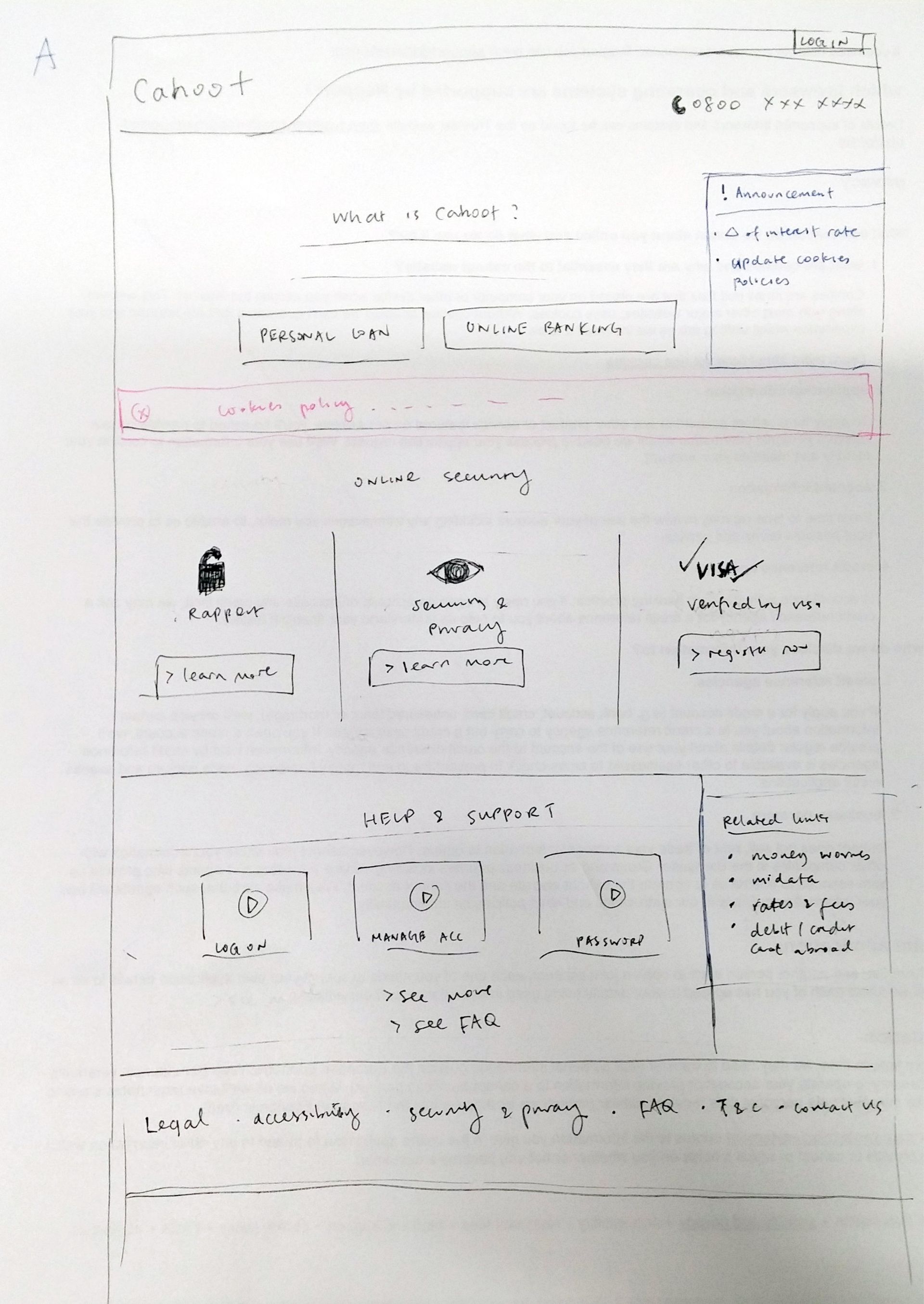
2 days of discovery to identify problems of the current website
IDENTIFIED PROBLEMS:
- lack of navigation
- homepage lack of hierarchy; 6 boxes with different style consistency and imagery
- lengthy inside page content without structure makes the reader unable to digest the content
- content is written by client and it is very print-based
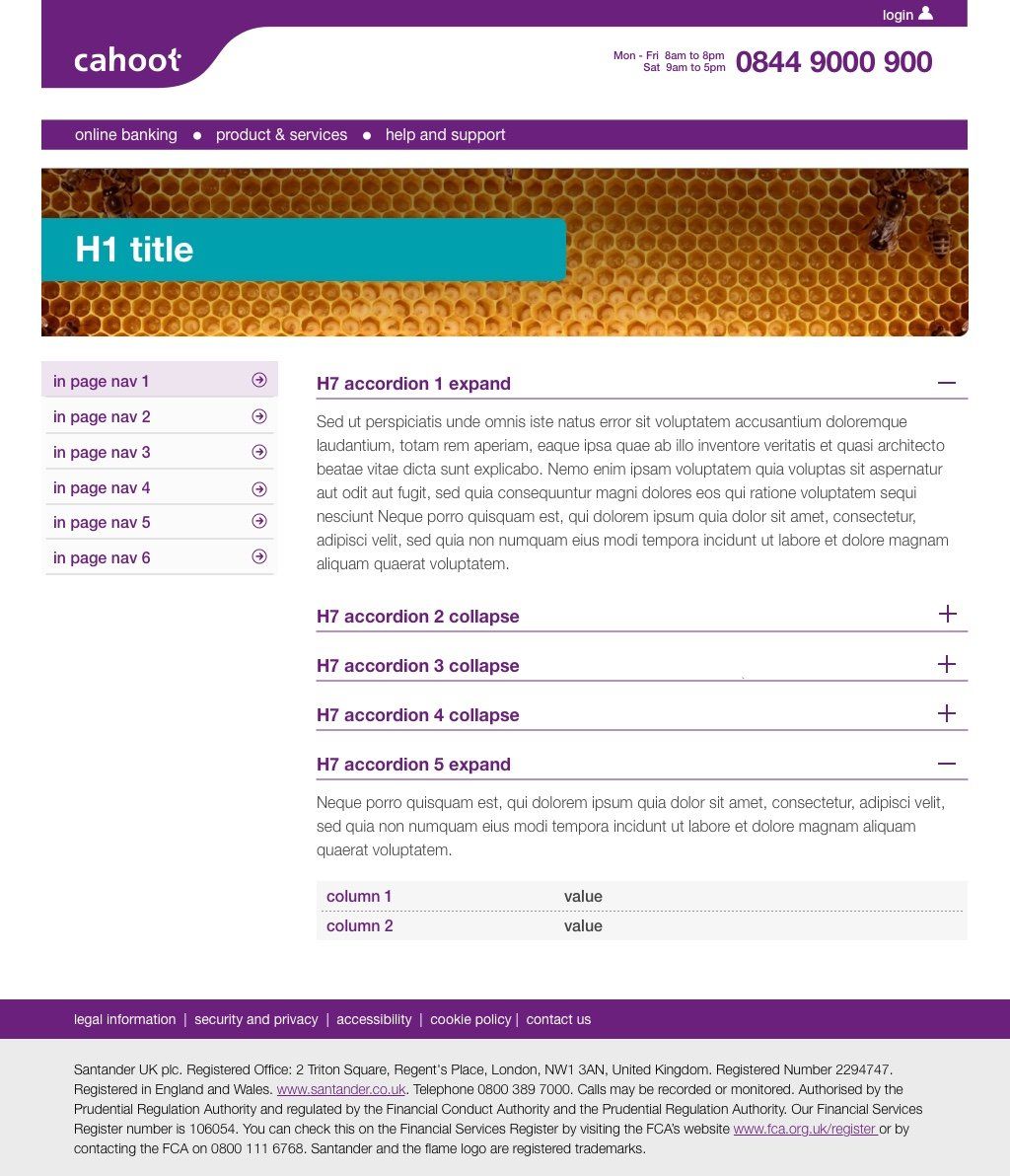
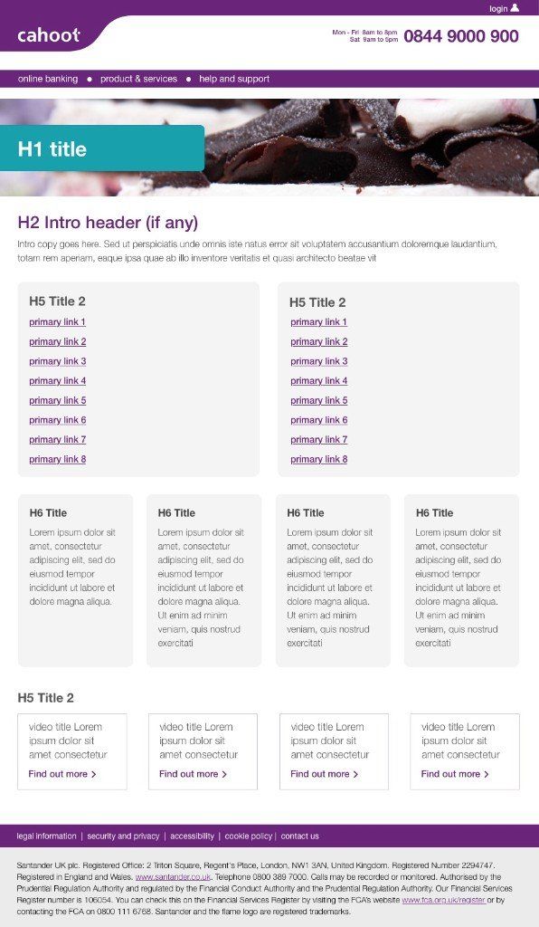
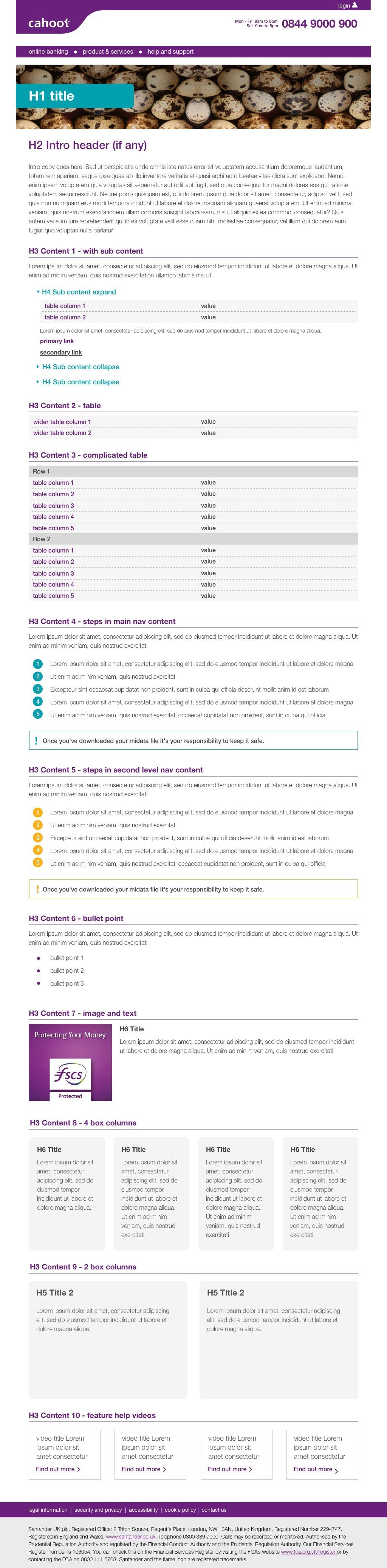
Homepage
Content page
FAQs
STEP 2:
- identify the site’s primary audience with the client
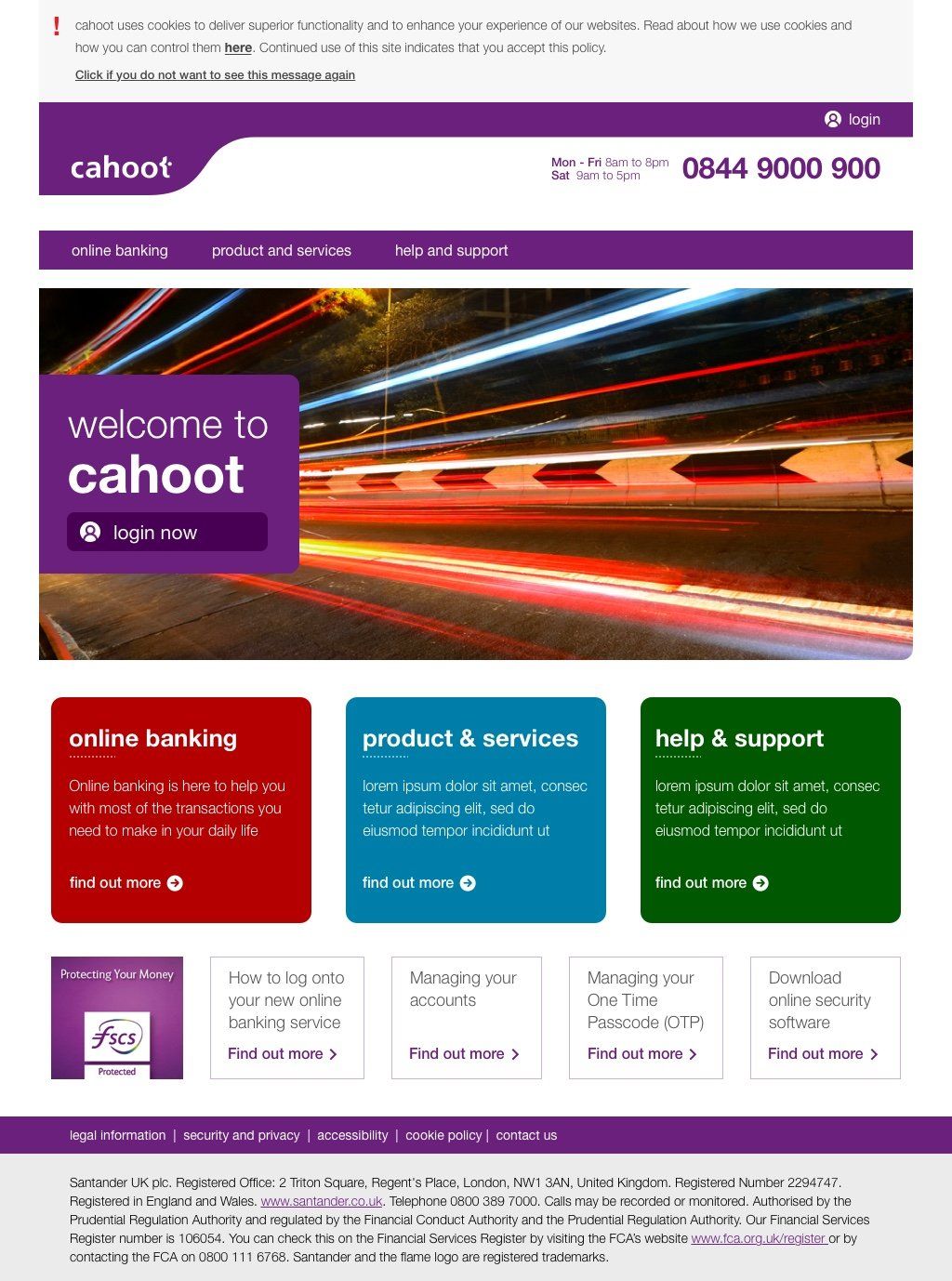
- create proper hierarchy for landing page
- create a navigation & reduce top level navigation items to avoid decision paralysis
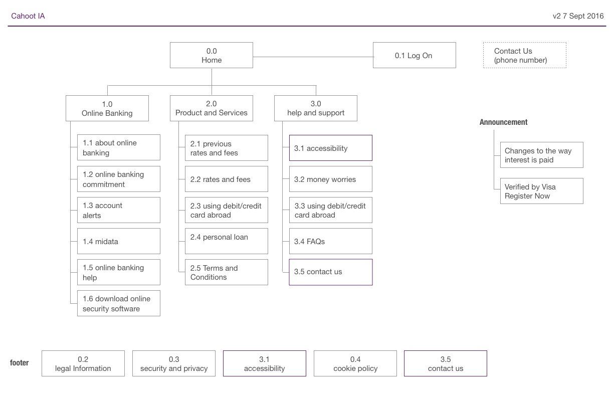
- restructure IA for easy wayfinding
- combine relevant items/content to reduce user’s stress (cognitive load)
- provide a clear navigation structure to categorize items based on hierarchy (taxonomy)
- revise naming to make it easier for everyday users to understand
IA based on current website
New IA
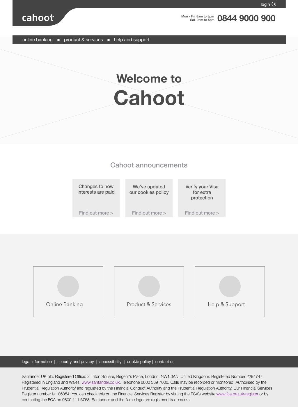
SOLUTION
- propose best practise of hierarchy of content to the client
- digest the whole website content, analyze different types of content and give out a template to client for better restructuring & content input
- provide adequate pattern library for a modular based CMS design
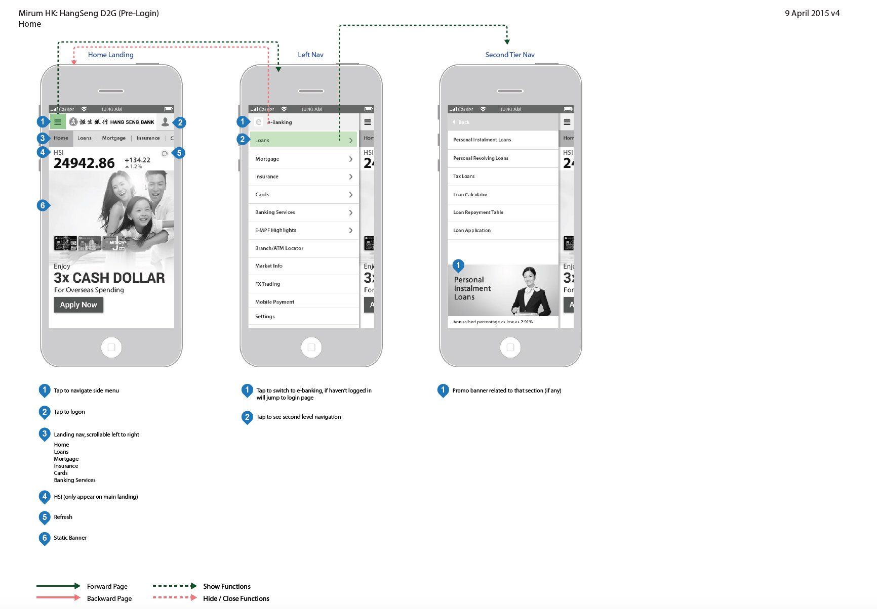
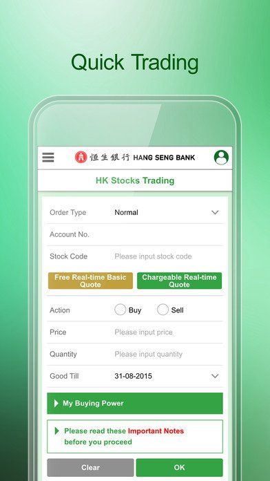
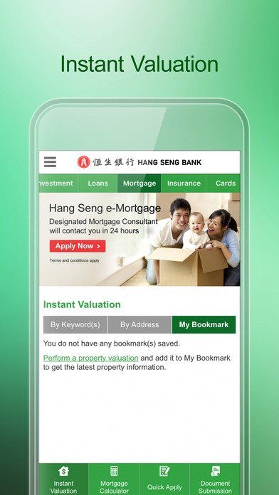
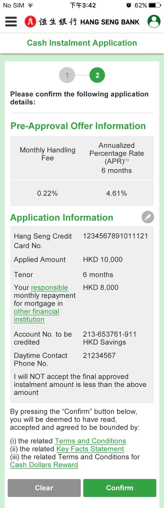
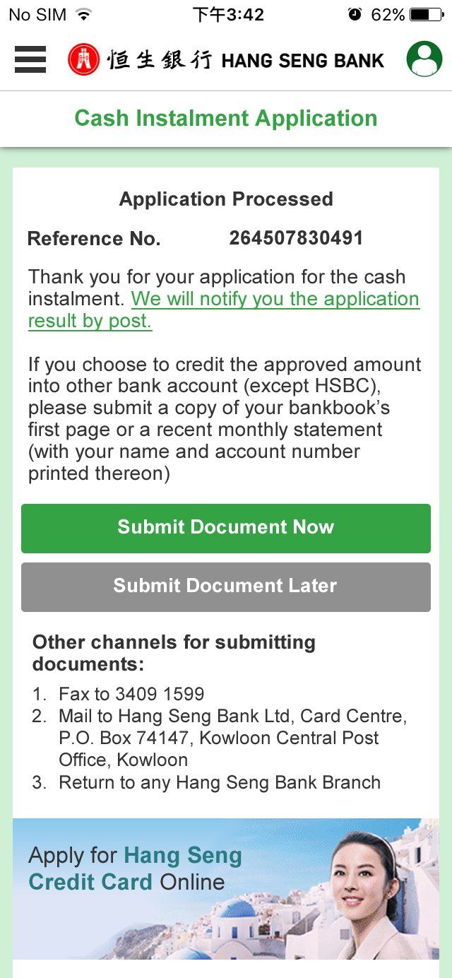
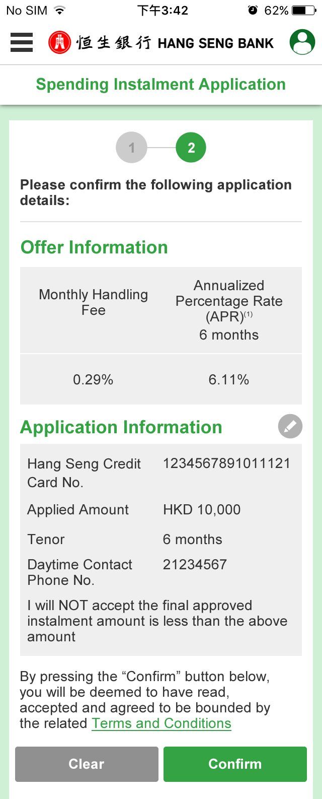
Hang Seng Bank Mobile App Revamp
BRIEF: To re-design mobile app (web-based mobile app) for Hang Seng Bank Mobile app including before login and after login.
CHALLENGES:
- Bank has a highly secure backend system, hence two different servers are used for clients before login and after login, hence we
need to unify to create a seamless experience for users yet making sure both server can respond at the same time
need to unify to create a seamless experience for users yet making sure both server can respond at the same time
- A banking app comprises of e-banking, insurance, loan, mortgage products, buying stocks; it has a very huge information
architecture, hence making sure user can navigate easily around and finish their goals smoothly is very important
architecture, hence making sure user can navigate easily around and finish their goals smoothly is very important
- To consider how to upsell products that best interests clients when they navigate to different sections
ROLE:
Lead UX designer
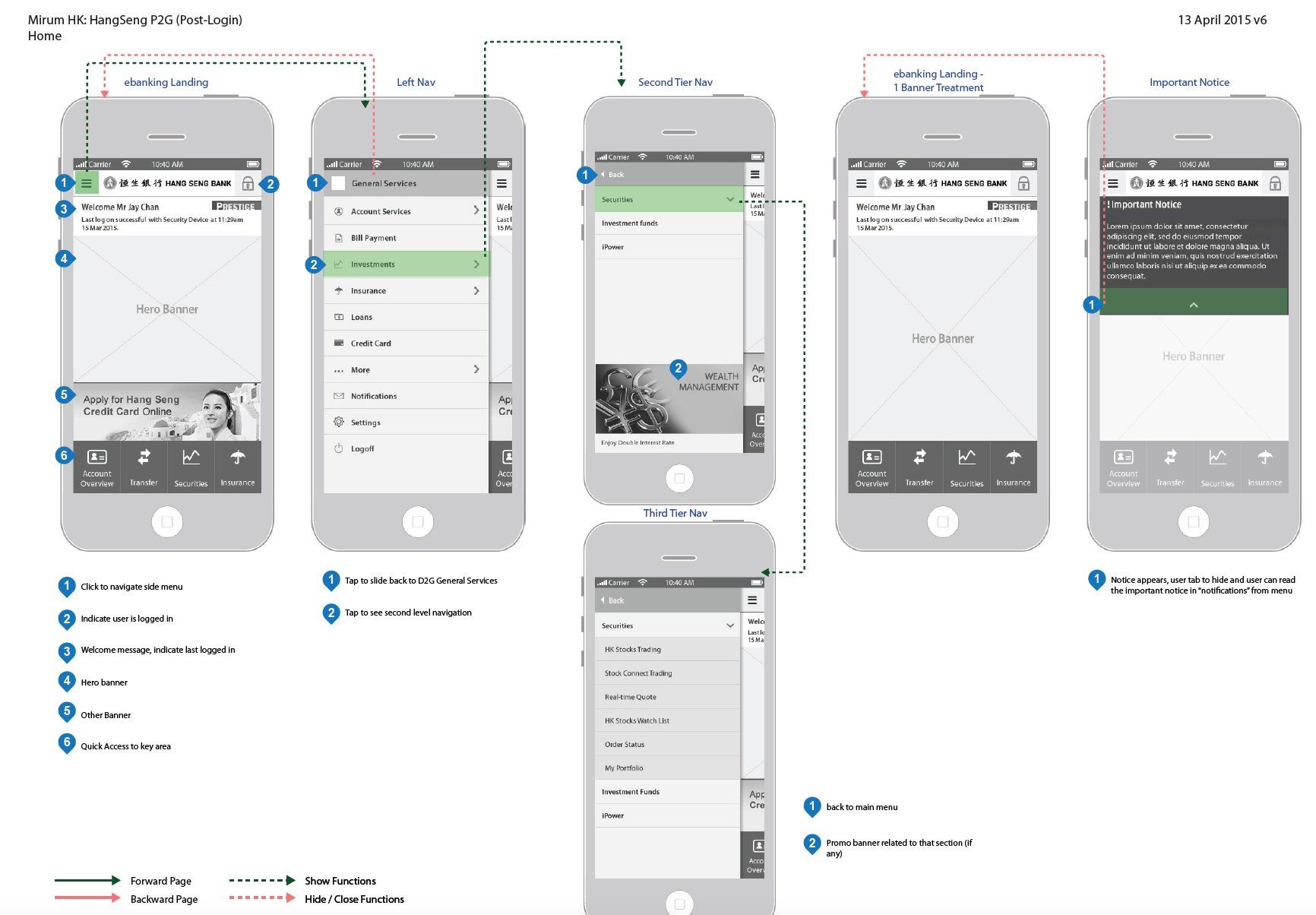
Landing page before login and side navigation
Landing page after login and side navigation
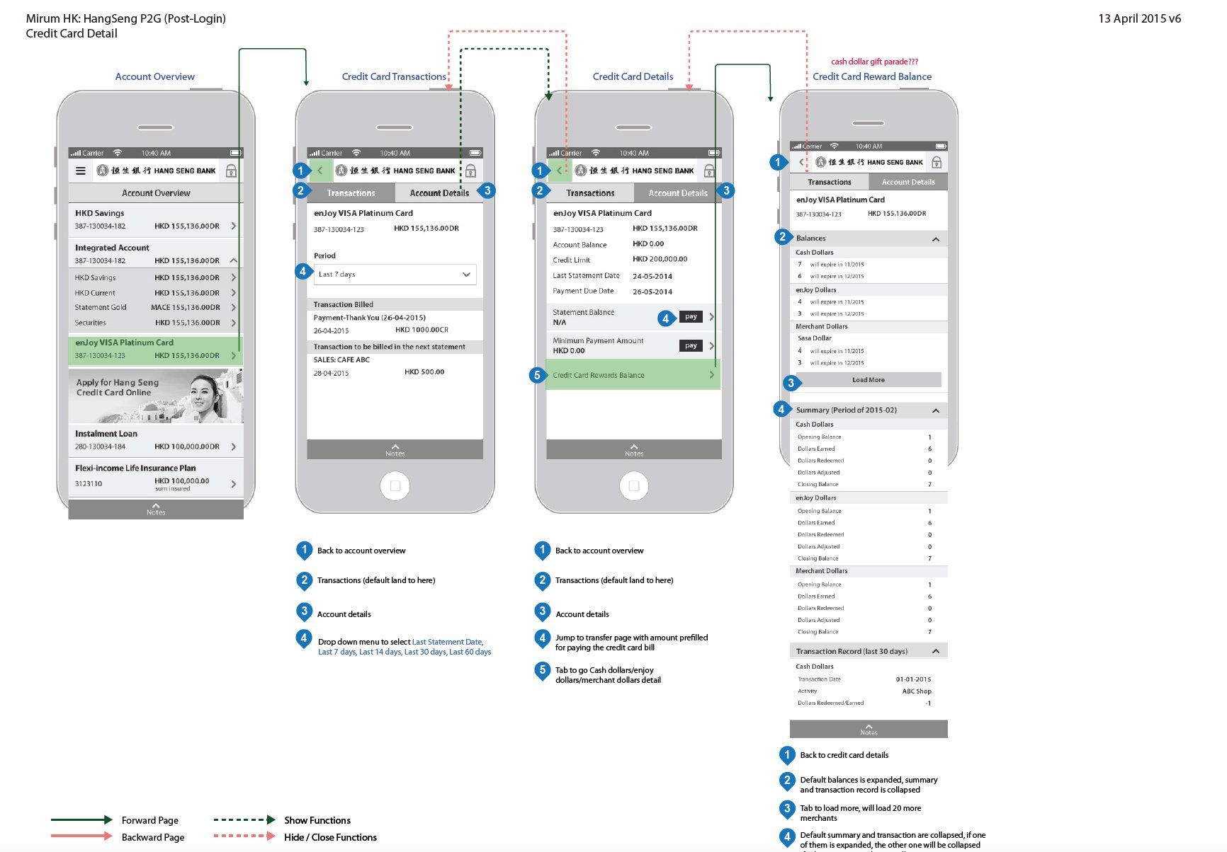
Credit card and payment
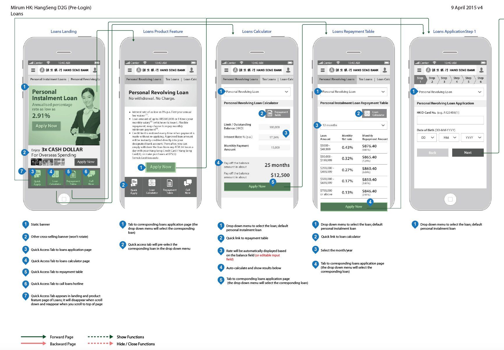
Application for personal loan flow
SOLUTION:
- Rearrange IA through card-sorting with stakeholders; hence make sure navigation is grouped under user's interest
- Design of quick access tab that would disappear when user scrolls down and ensure necessary tabs are displayed
- Streamline display of table and loan calculator with pre-populated figures so user would have less friction
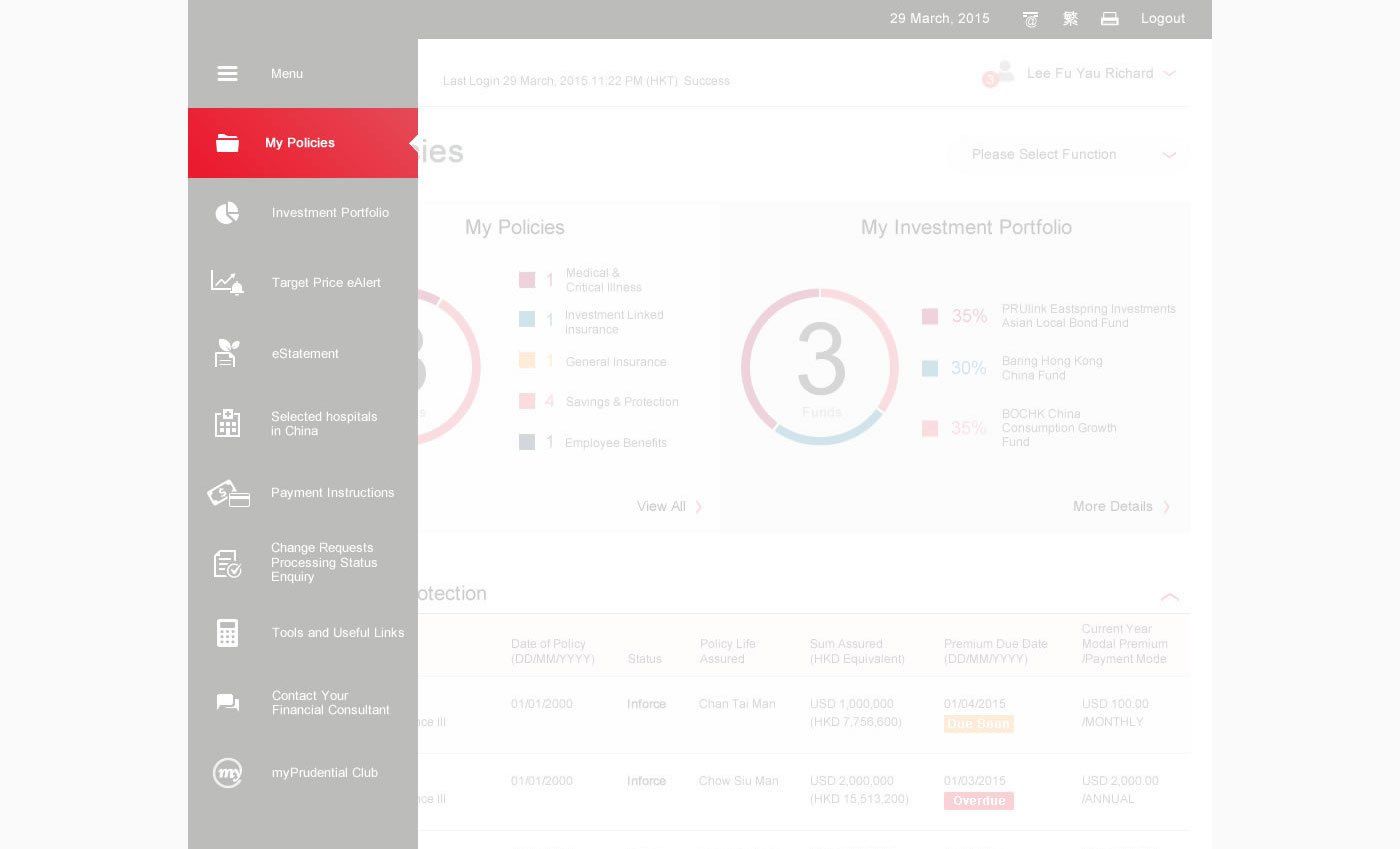
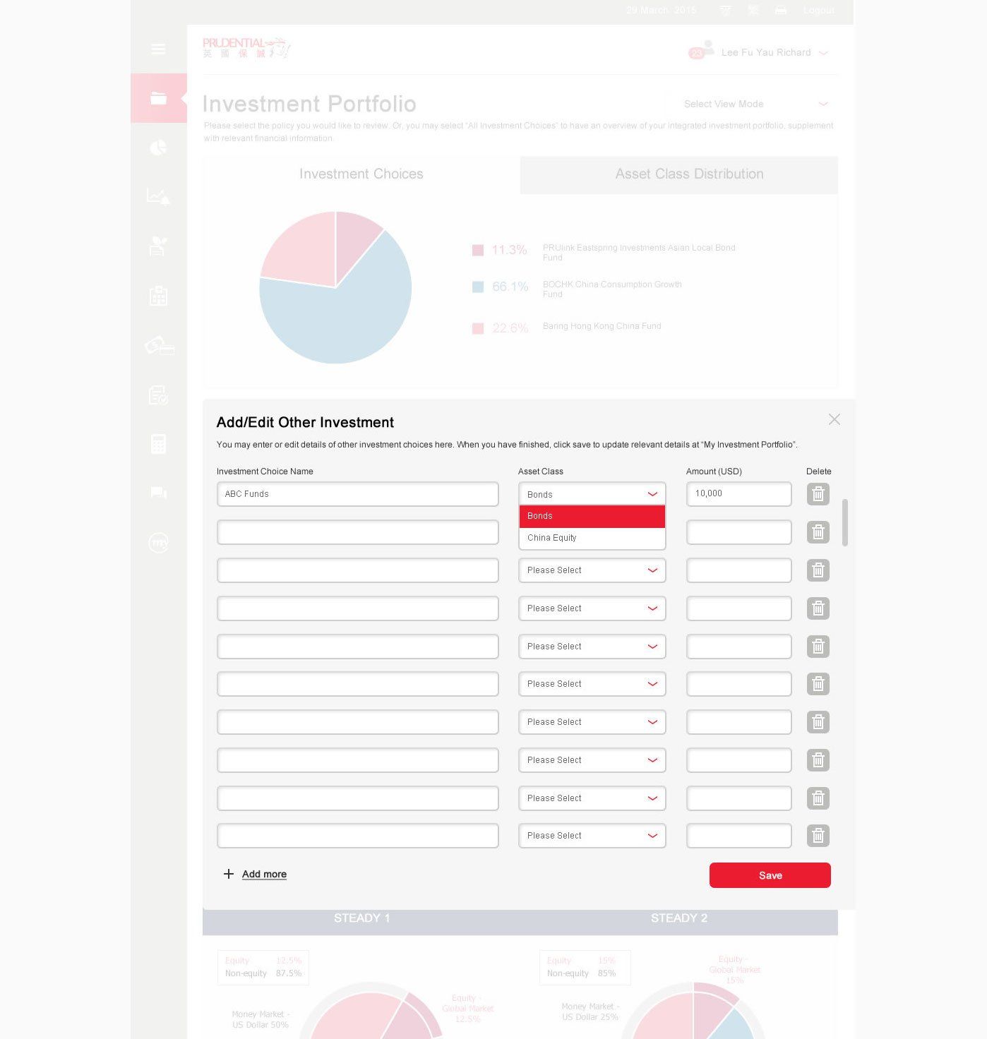
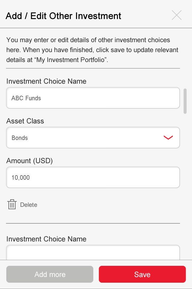
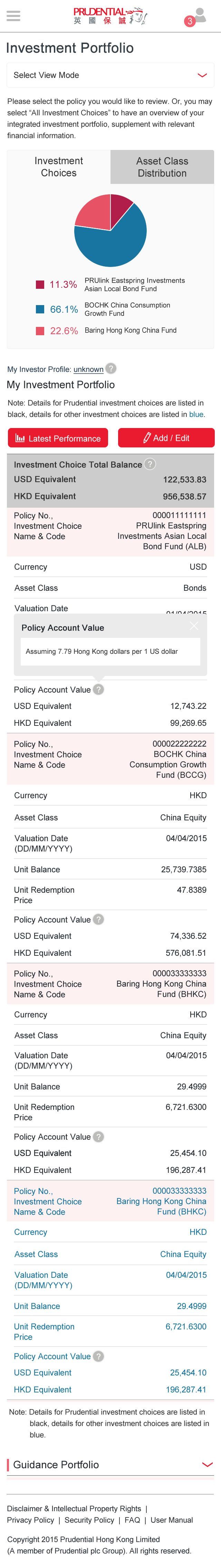
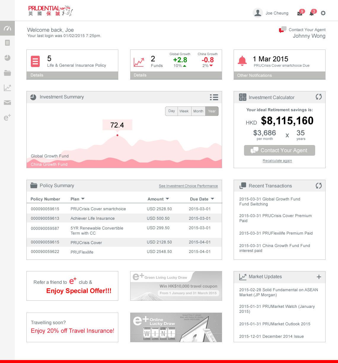
Prudential Insurance customer login portal redesign
Initial concept
Dashboard to show important info that best interests the user,
investment calculator and other upselling banner on the side to reduce friction.
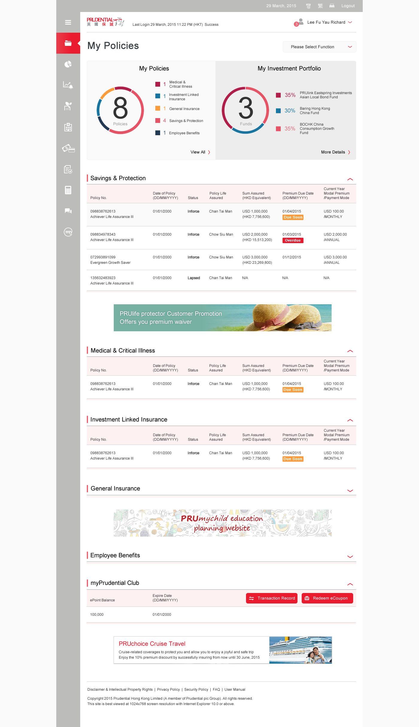

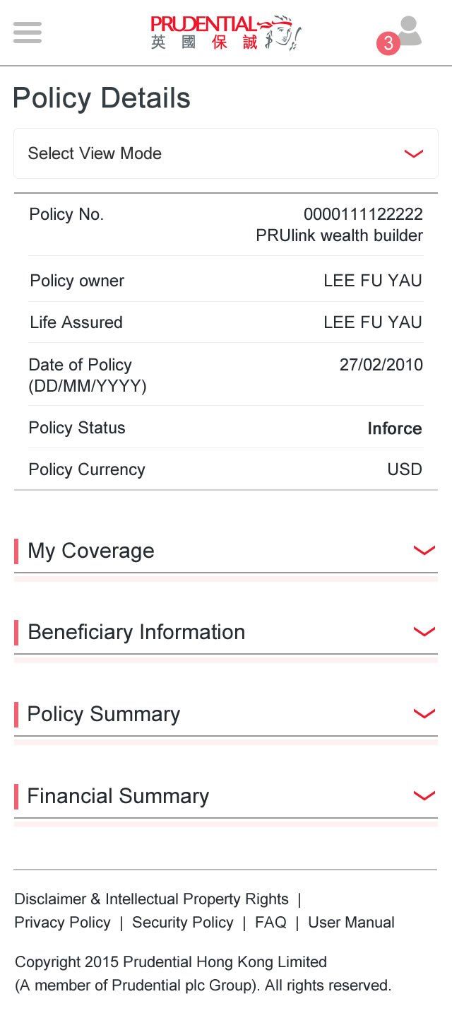

These design have been brought to usability testing, things we need to prove:
- iconography of the dashboard, is it clear for the user to understand?
- general usage of colours and colour contrast readability
- change of investment funds for both desktop users and mobile users, as this is the most complicated part.