Helly Hansen DEMO TEAM
BRIEF:
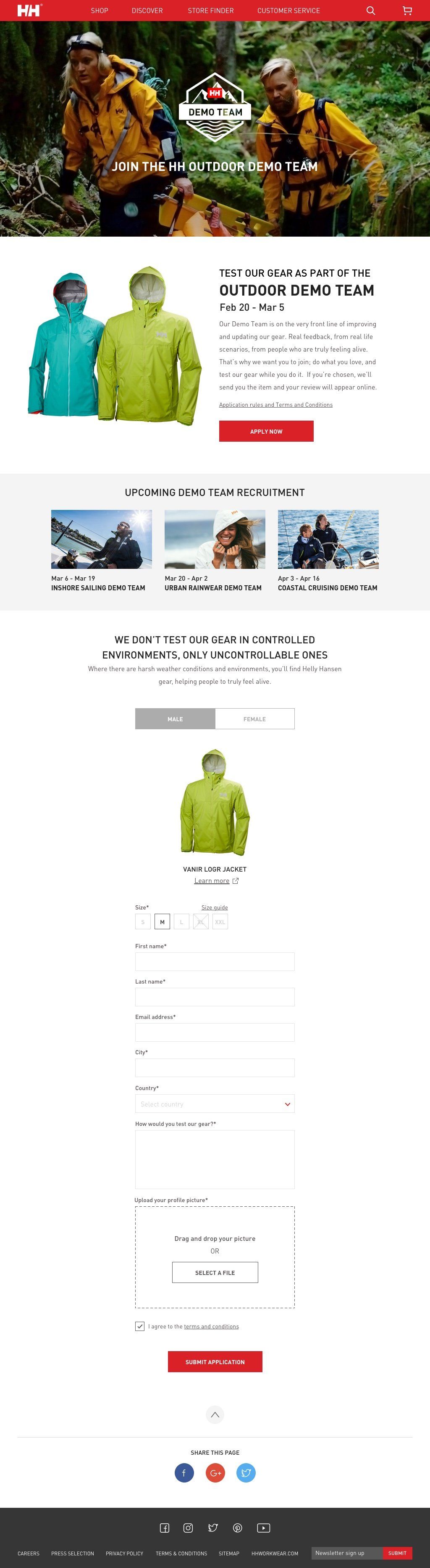
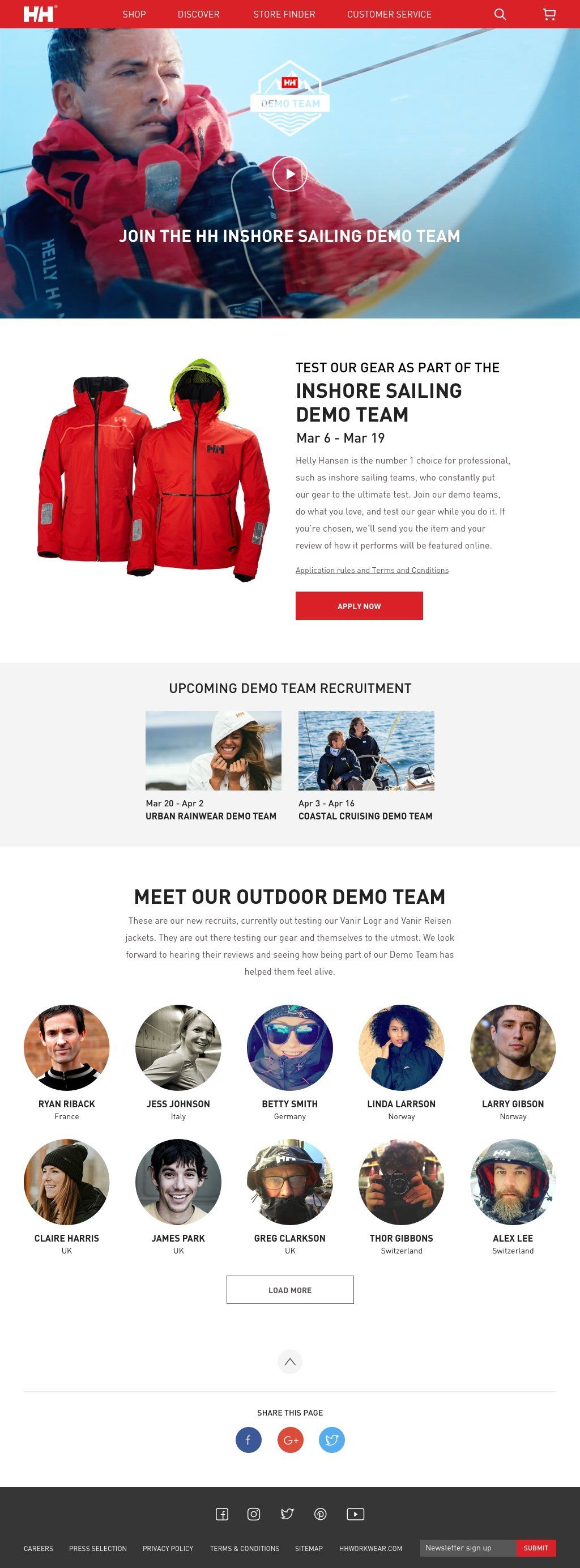
Demo team is an annual campaign where Helly Hansen recruits general public to be part of the demo team to test out their jackets. The campaign is divided into 4 categories of outdoor, sailing (offshore and inshore), urban rainwear in 4 different phases, users are required to select the jacket they want to test and to give a summary of how would they test the jacket. Jackets will be sent to successful candidates. Later on their reviews would be published to the demo team site about their testing process, rating and thoughts.
CHALLENGE:
The demo team consists of different stages: recruitment of demo team regarding different category, announcement of demo team candidates and how they are going to test the jacket. Once they have received the jacket, they would fill in their reviews. The campaign site has to display content dynamically according to different period of time.
ROLE:
UX Designer
UX Designer
Demo Team campaign site in 2016
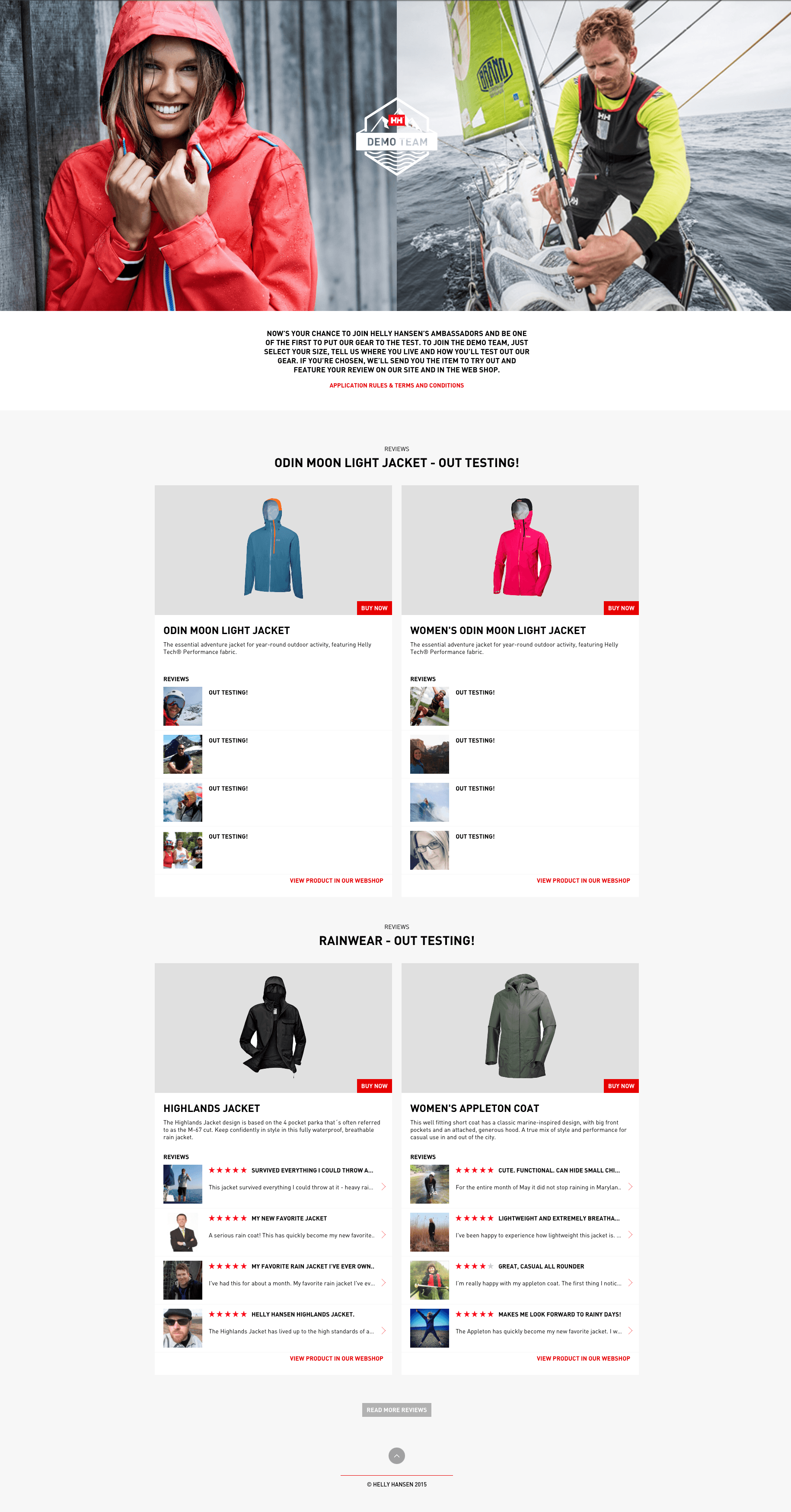
Helly Hansen demo team designed by another agency
KEY PROBLEMS:
- page structure does not address content hierarchy
- CTA button placement is not relevant
- putting participant's profile pic is not engaging enough
- application form didn't address gender and no size guide for the jackets
- cross-link of social instagram campaign does not help promote demo team
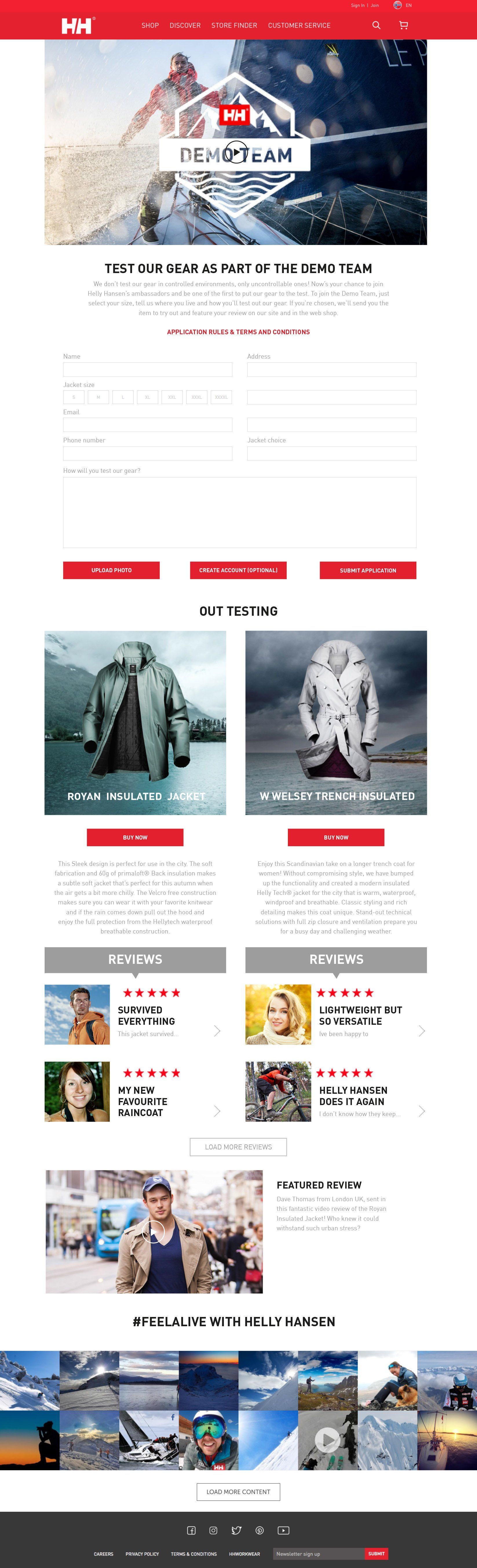
Prototype with annotations:
SOLUTION:
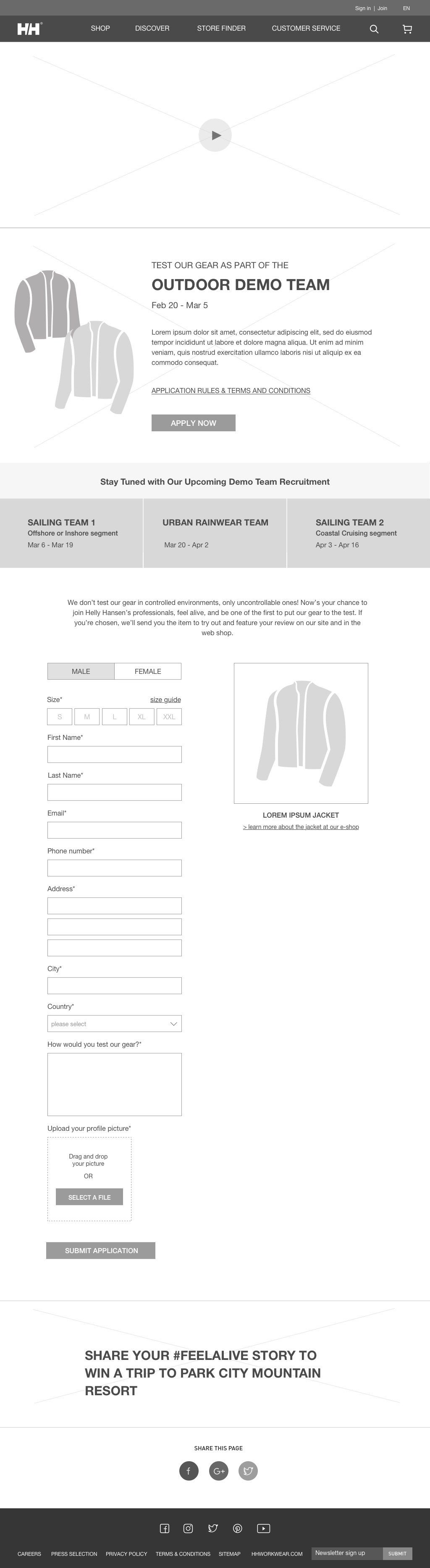
- design modular based template that caters different hierarchy in terms of different timeline
- first phase, introduction to demo team, announcing keydates of recruitment, main priority is recruitment of team members,
hence the form is placed upfront
hence the form is placed upfront
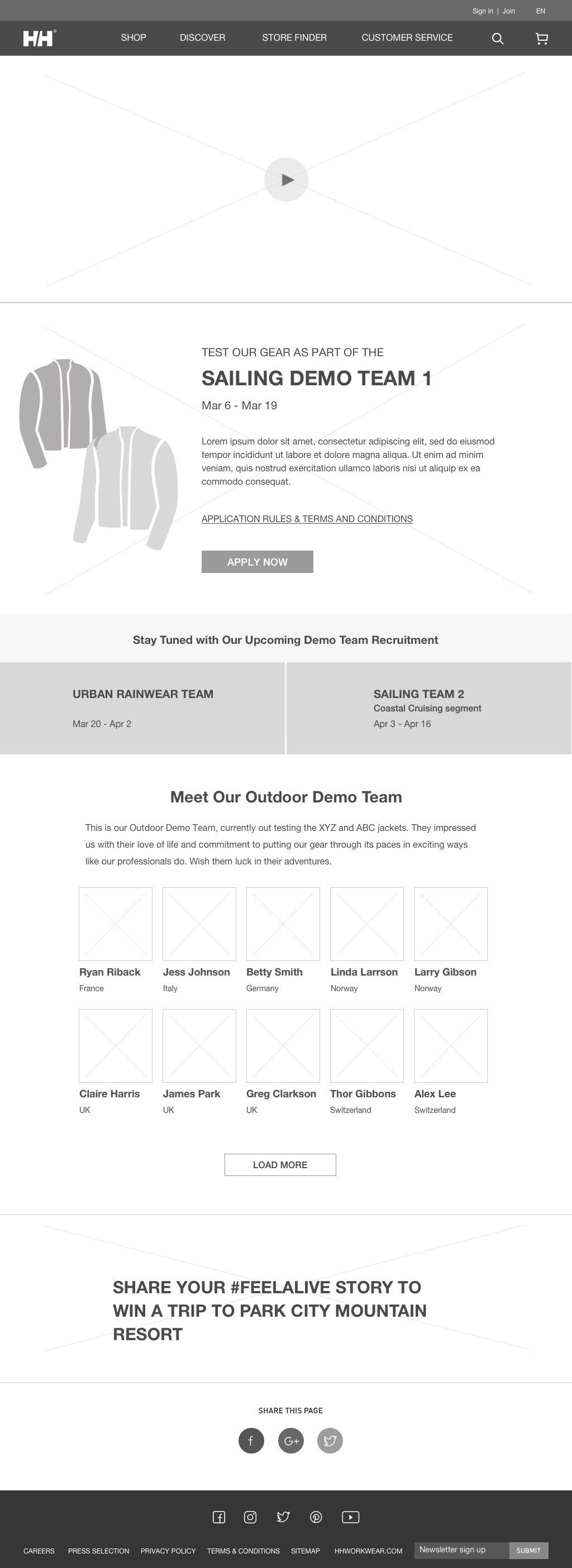
- second phase, recruitment & announcement of the selected demo team members, form is made collapsed, yet users who want
to sign up can easily click the form and it would expand for them to sign up
to sign up can easily click the form and it would expand for them to sign up
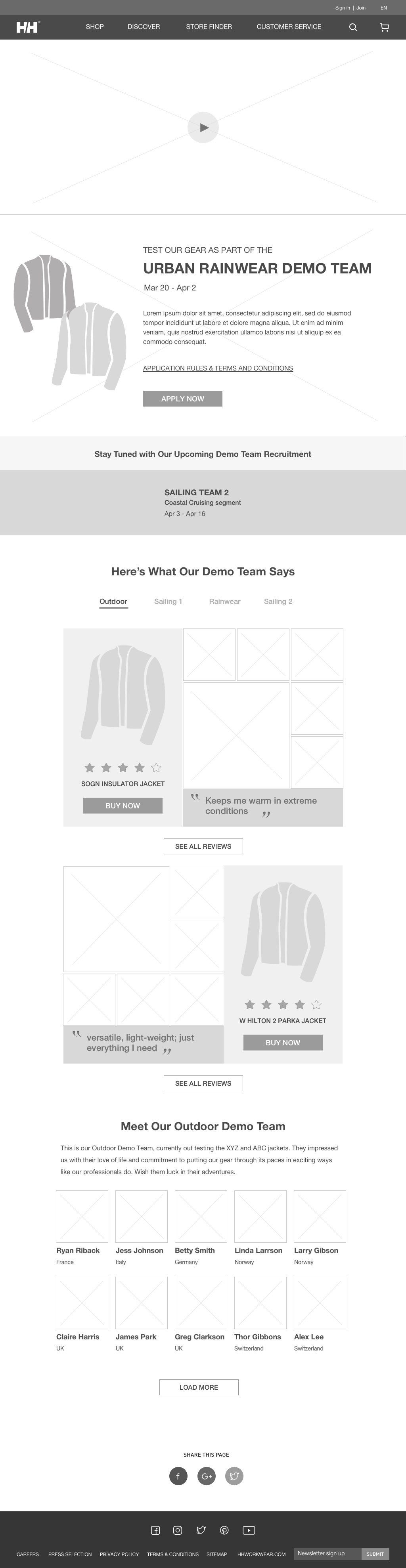
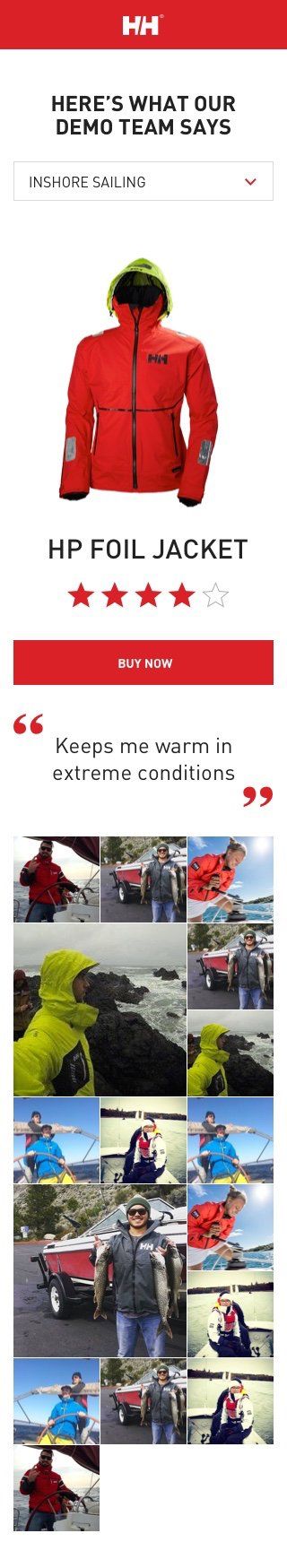
- third phase, demo team's reviews of jacket, team members information

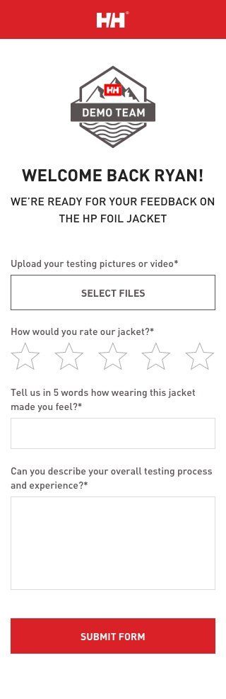
Pushing for a more convenient workflow
Previously, the candidates submitted their reviews through emailing to Helly Hansen. In order to streamline the process, we've proposed a form with a unique ID to be sent out to each candidate through enewsletter for submitting their reviews and Helly Hansen can manage it through CMS whether to publish it or not. We can also identify different form fields to be displayed in the webpage to make the content more interesting.
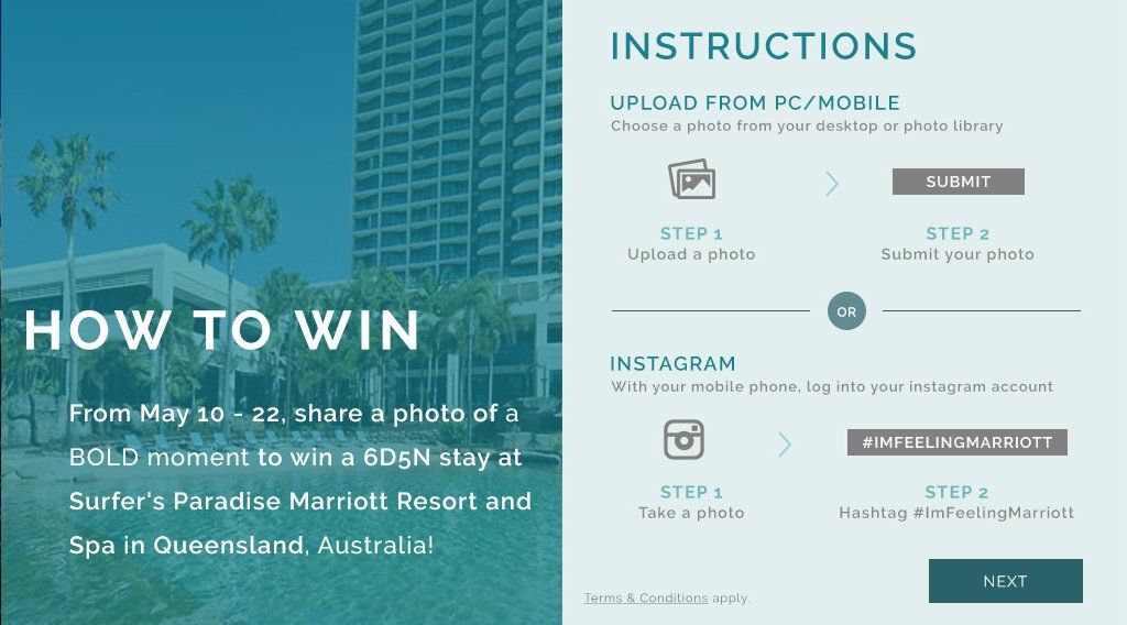
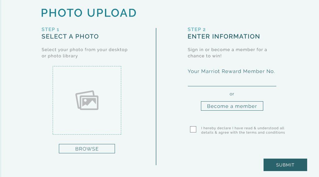
MARRIOT REWARDS
ROLE: Concept & Art Direction, UI/UX
Banner ad


Website
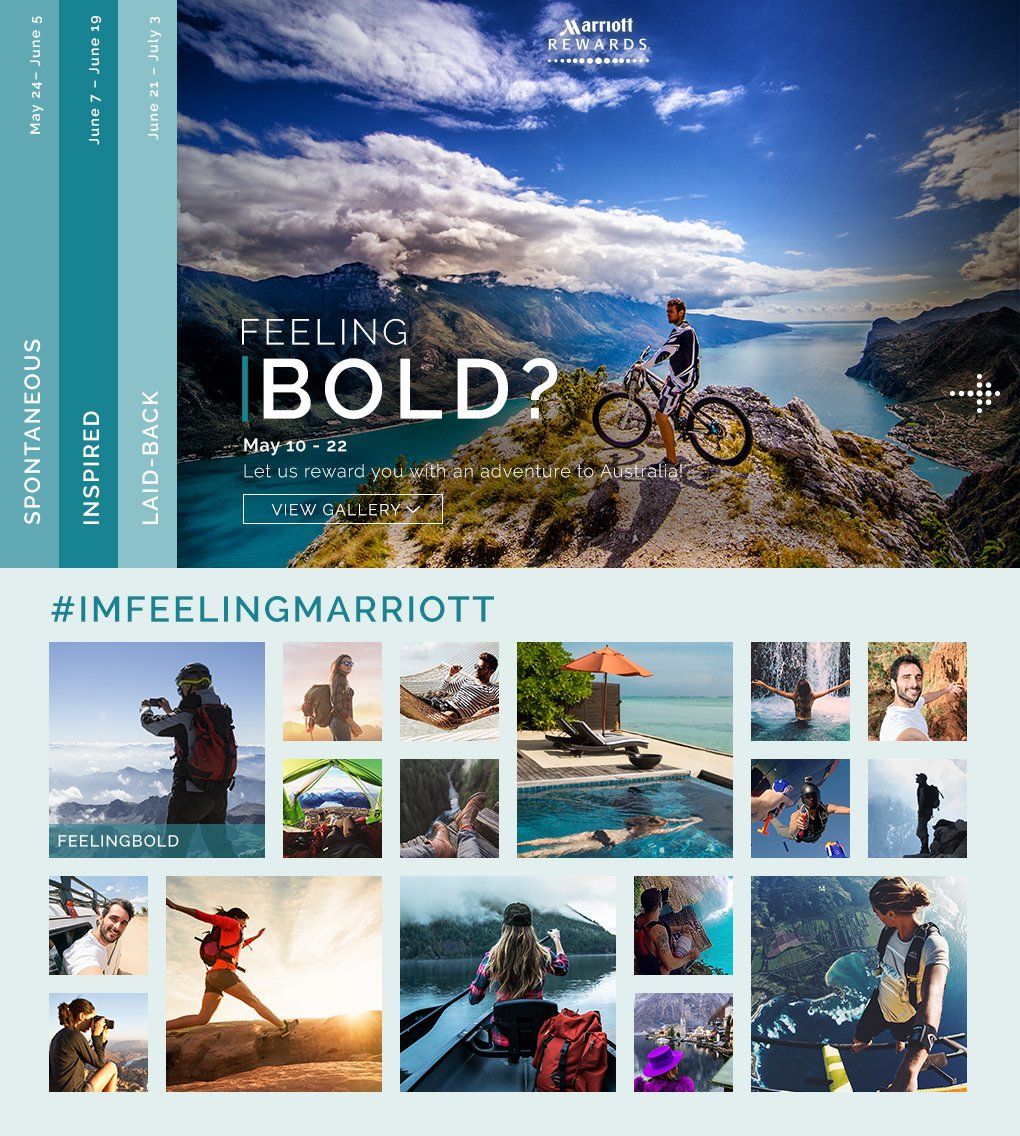
Vertical scrolling to see gallery, Horizontal scrolling for form